20 Dark Academia Color Palette Ideas You'll Love
Discover 20 enchanting Dark Academia color palette ideas that blend moody sophistication with intellectual charm. Perfect for creating spaces that evoke vintage libraries, prestigious universities, and timeless elegance.
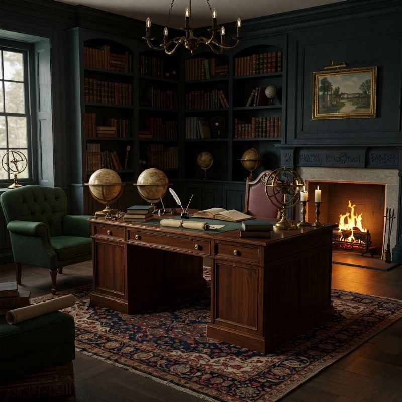
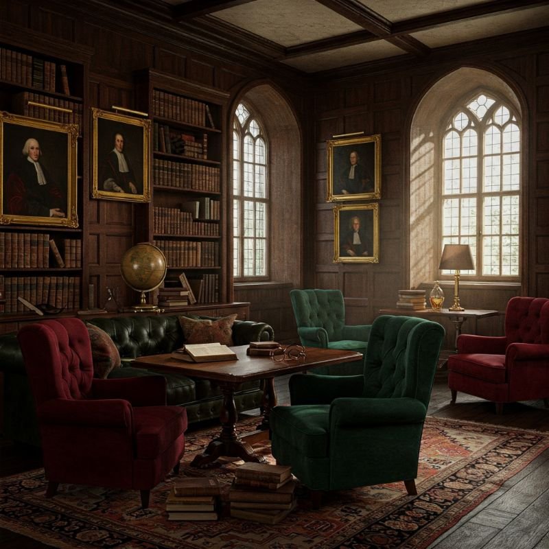
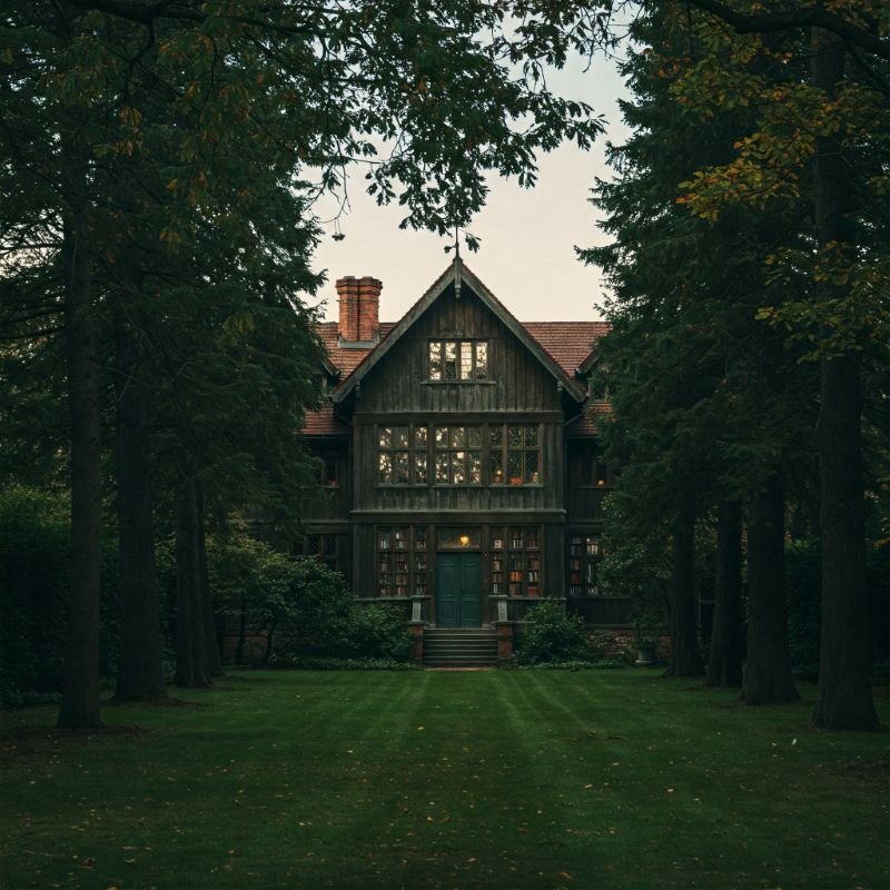
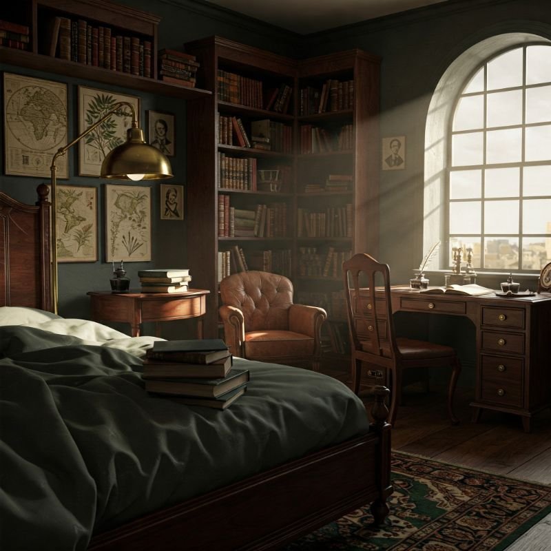
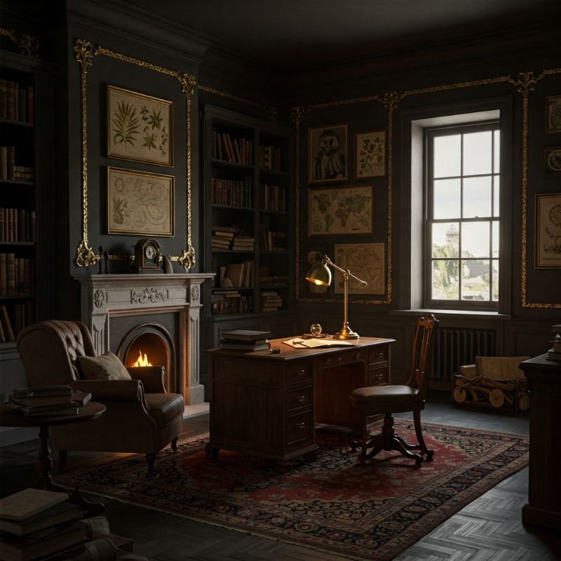
The allure of Dark Academia aesthetics has captivated designers, artists, and enthusiasts alike, whisking us away to a world where knowledge is sacred and beauty dwells in shadowy corners. This intellectual style, rooted in classic literature and prestigious educational institutions, draws its power from a sophisticated color palette that speaks of aged leather-bound books, mahogany shelves, and the golden glow of desk lamps illuminating ancient texts. If you've ever yearned to transform your space into a sanctuary of scholarly pursuits and poetic charm, the right color combination can transport you to the hallowed halls of Oxford or the secret societies of fictional prep schools. In this article, we'll explore 20 captivating Dark Academia color palettes that embody the essence of this aesthetic—from rich, velvety browns to mysterious forest greens, from burnished golds to the deepest midnight blues. These carefully curated selections will inspire you to create spaces that feel both timeless and intensely personal, perfect for contemplation, creation, and the pursuit of knowledge in all its forms.
1. The Essence of Dark Academia Colors
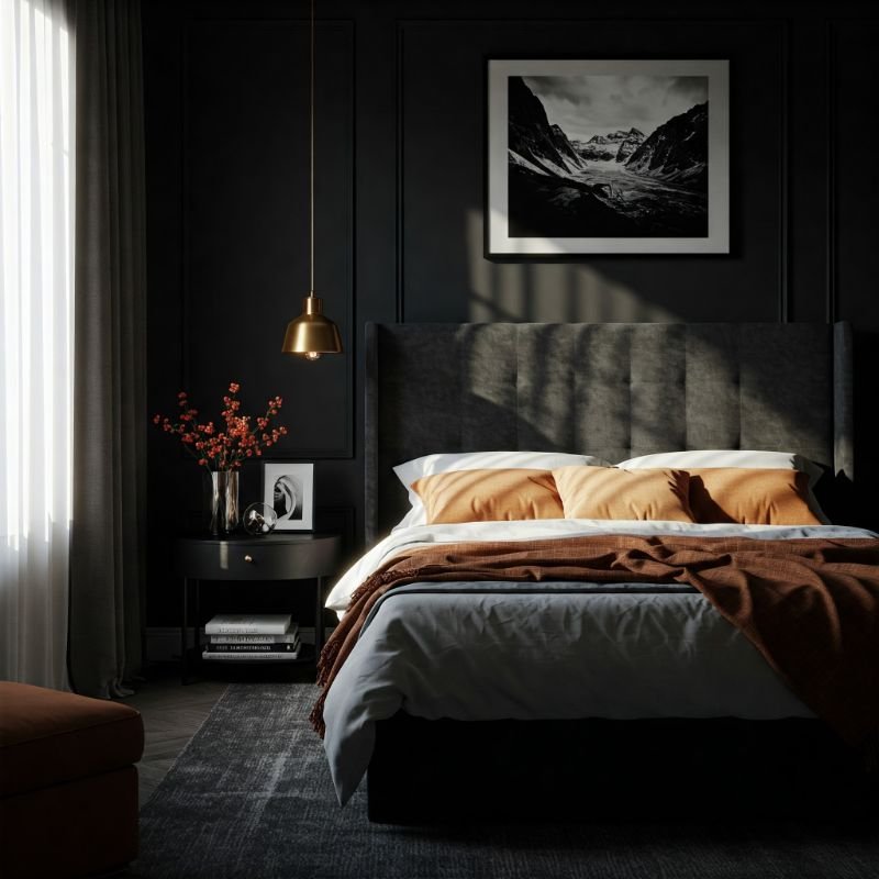
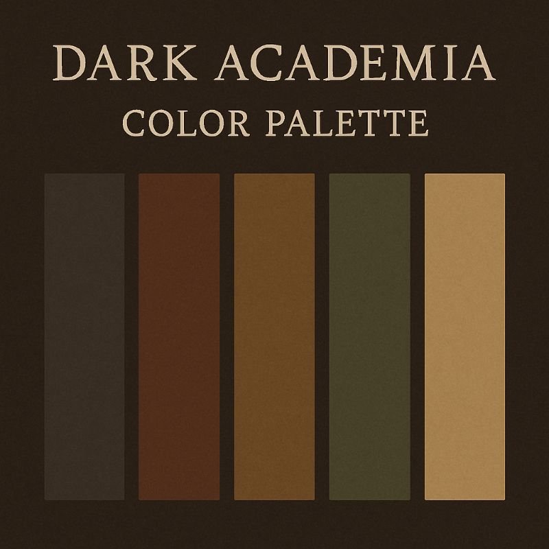
Dark Academia draws its distinctive character from a color foundation that evokes intellectual pursuit, historical depth, and romantic nostalgia. At its core, this aesthetic embraces deep, rich tones that might adorn prestigious universities or vintage bookshops—think mahogany browns, forest greens, burgundy reds, and inky blues. These colors aren't simply dark; they carry warmth and complexity that suggests wisdom accumulated over centuries. Cream, gold, and amber serve as crucial highlights, reminiscent of aged paper, candlelight, and polished brass fixtures. Haven't you noticed how these colors instantly transport you to a world where knowledge is treasured and beauty is found in weathered elegance? What makes Dark Academia palettes particularly captivating is their ability to balance moodiness with sophistication, creating spaces that feel both mysterious and inviting—perfect for those who find comfort in intellectual pursuits and historical aesthetics.
2. Classic Library Corner Palette
This foundational Dark Academia palette captures the essence of time-honored university libraries with their towering bookshelves and hidden alcoves. Anchor your space with rich walnut brown (RGB: 73, 55, 36), reminiscent of centuries-old wooden shelving and study tables worn smooth by generations of scholars. Complement this with a deep burgundy (RGB: 128, 0, 32) that recalls leather-bound book covers and ornate armchairs. Introduce oxford blue (RGB: 0, 33, 71) for accents that suggest academic prestige and intellectual depth. Warm the composition with amber gold highlights (RGB: 255, 191, 0) that mimic the glow of reading lamps and polished brass fixtures. Finally, incorporate cream parchment (RGB: 255, 253, 208) as a neutral that evokes aged manuscripts and creates breathing space in your design. This palette strikes the perfect balance between scholarly gravitas and inviting warmth, making it ideal for home libraries, reading nooks, or study areas.
3. Midnight Scholar's Study Palette
When the clock strikes midnight and only the most dedicated scholars remain hunched over ancient texts, this palette emerges from the shadows. Deep midnight blue (RGB: 25, 25, 112) forms the foundation, creating a cocoon-like atmosphere that focuses the mind and encourages deep thought. Charcoal gray (RGB: 54, 69, 79) adds sophistication and mimics the look of slate chalkboards where theories take form. Bronze (RGB: 205, 127, 50) introduces warmth through desk lamps, fixtures, and decorative elements, preventing the space from feeling too austere or cold. Forest green (RGB: 0, 68, 27) offers a touch of natural wisdom, reminiscent of the ivy-covered walls of prestigious institutions. A subtle infusion of plum (RGB: 72, 50, 72) adds unexpected depth and richness, like the binding of a treasured book discovered in a forgotten corner. Haven't you always wanted a space that feels like it holds secrets only revealed to those patient enough to seek them?
4. Vintage Manuscript Collection Palette
This palette draws inspiration from ancient manuscripts with their carefully preserved pages and ornate illuminations. Parchment beige (RGB: 255, 234, 188) serves as the primary neutral, reminiscent of aged paper that has survived centuries of human wisdom. Sepia brown (RGB: 112, 66, 20) adds depth and recalls the faded ink of handwritten notes in margins. Deep emerald green (RGB: 0, 73, 66) brings a touch of mystery, suggesting the private collections of dedicated scholars. Rich mahogany (RGB: 103, 54, 34) grounds the palette with its connection to antique desks and display cases where precious texts are kept. Gold leaf accents (RGB: 212, 175, 55) elevate the composition, mimicking the precious metal embellishments found on the most valuable historical documents. This combination creates a space that feels both scholarly and slightly mysterious, as if each corner might reveal a forgotten piece of knowledge waiting to be rediscovered.
5. Oxford Common Room Palette
Transport yourself to the exclusive common rooms of prestigious universities with this refined yet comfortable palette. Tobacco brown (RGB: 78, 52, 46) forms the foundation, recalling wood-paneled walls that have absorbed decades of intellectual debate. Hunter green (RGB: 53, 94, 59) appears on upholstered furniture and drapery, creating a sense of established tradition. Oxblood red (RGB: 121, 7, 17) provides dramatic contrast in leather-bound books and accent pieces, adding passion to intellectual pursuits. Burnished brass (RGB: 183, 149, 11) warms the space through lighting fixtures and decorative objects, suggesting the golden glow of late-night discussions. Ivory (RGB: 255, 255, 240) lightens the mood through ceiling details and textiles, preventing the space from feeling too heavy or masculine. Haven't you always imagined yourself in such hallowed halls, engaging in profound conversation over a glass of aged scotch? This palette brings that fantasy to life in your own space.
6. Weathered Bookbinding Palette
The tactile pleasure of handling old books—their scuffed corners, faded spines, and softened edges—inspired this deeply satisfying palette. Aged leather brown (RGB: 97, 63, 45) forms the foundation, while distressed maroon (RGB: 128, 0, 32) adds richness through its associations with traditional bookbinding techniques. Naval blue (RGB: 0, 48, 73) introduces a scholarly element, perhaps reminiscent of the uniform worn by students at prestigious academies. Tarnished gold (RGB: 207, 181, 59) reflects the faded splendor of once-bright lettering on beloved tomes. Antique white (RGB: 250, 235, 215) provides necessary contrast through pages yellowed with age and well-thumbed use. This combination creates spaces that feel lived-in and well-loved, where knowledge is not merely displayed but actively engaged with daily. The palette works particularly well in studies, reading corners, or anywhere you wish to create an atmosphere of contemplative comfort and intellectual curiosity.
7. Poetry and Parchment Palette
This palette captures the romantic essence of handwritten poetry on aged parchment, where emotions and intellect intertwine. Soft parchment (RGB: 241, 233, 210) provides a neutral base that's warm rather than stark, creating a canvas for deeper hues. Ink black (RGB: 0, 20, 39) adds definition and drama, representing the flowing script of poets capturing profound thoughts. Muted lavender (RGB: 150, 123, 182) introduces an unexpected romantic element, suggesting pressed flowers kept between pages of favorite verses. Rich chestnut (RGB: 149, 69, 53) grounds the palette with its earthy warmth and connection to wooden writing desks worn smooth with use. Antique gold (RGB: 205, 149, 12) adds subtle illumination, like candlelight flickering across pages during late-night writing sessions. This combination creates spaces that feel introspective yet expressive, perfect for bedrooms, creative studios, or contemplative corners where you might be inspired to pen your own reflections.
8. Candlelit Reading Nook Palette
What could be more quintessentially Dark Academia than a secluded corner illuminated only by flickering candlelight? This palette captures that intimate atmosphere where time seems to stand still. Deep espresso brown (RGB: 61, 42, 33) creates a cocoon-like environment that blocks out modern distractions. Amber (RGB: 255, 191, 0) provides essential warmth, mimicking the gentle glow of candle flames casting shadows across ancient texts. Bordeaux red (RGB: 99, 7, 35) adds passion and depth through textiles and accent pieces. Charcoal (RGB: 54, 56, 68) introduces subtle contrast without harshness, like shadows dancing on walls. Cream (RGB: 253, 248, 227) lightens the composition through aged pages and linens, preventing the space from feeling oppressive. Have you ever lost yourself in a book so completely that hours passed without notice? This palette creates exactly that environment—one where the outside world fades away and only the story in your hands matters.
9. Ivy League Legacy Palette
This palette draws upon the prestigious heritage of Ivy League institutions with their blend of academic excellence and architectural grandeur. Forest green (RGB: 1, 68, 33) serves as the foundation, recalling the ivy-covered buildings that lend these universities their collective nickname. Harvard crimson (RGB: 165, 28, 48) adds tradition and gravitas through its association with America's oldest university. Smoky gray (RGB: 116, 116, 116) contributes an element of contemplative seriousness, like stone buildings that have witnessed generations of scholarly achievement. Antiqued brass (RGB: 205, 149, 47) brings warmth through fixtures, hardware, and decorative elements. Eggshell white (RGB: 240, 234, 214) provides necessary contrast through architectural details and textiles. This combination creates a space that feels established and prestigious without appearing pretentious—perfect for home offices, studies, or anywhere you wish to create an atmosphere conducive to achievement and intellectual growth.
10. Antique Globe and Maps Palette
The faded colors of old world maps and aged globes inspire this palette that celebrates exploration through knowledge. Aged parchment (RGB: 226, 220, 188) forms the neutral base, reminiscent of hand-drawn maps from centuries past. Ocean blue (RGB: 0, 105, 148) adds depth and mystery, representing unexplored territories and the quest for discovery. Terra cotta (RGB: 204, 114, 61) introduces warmth through its association with landmasses on antique globes. Espresso brown (RGB: 87, 65, 47) grounds the palette with its connection to wooden stands and map cases. Verdigris (RGB: 67, 179, 174) adds an unexpected accent, like the patina on copper or brass elements that have aged gracefully. Don't you feel a certain thrill when tracing routes on old maps, imagining journeys both physical and intellectual? This palette captures that sense of scholarly adventure, creating spaces that inspire curiosity and the desire to explore beyond known boundaries.
11. Victorian Science Laboratory Palette
Channel the fascinating intersection of scientific inquiry and gothic aesthetics with this palette inspired by 19th-century laboratories. Slate gray (RGB: 112, 128, 144) forms the foundation, reminiscent of stone workbenches and practical surfaces. Bottle green (RGB: 0, 106, 78) adds intrigue through its association with mysterious substances preserved in glass containers. Burnished copper (RGB: 184, 115, 51) brings warmth and reflects the scientific instruments of the period. Plum (RGB: 89, 36, 99) introduces an unexpected richness, suggesting the curious blend of science and the supernatural that characterized Victorian thinking. Ivory (RGB: 255, 255, 240) lightens the composition through papers, diagrams, and bone specimens. This combination creates spaces with a compelling narrative—where rational inquiry meets gothic mystery. It works particularly well in home offices, studies, or rooms dedicated to collections of curious objects. Haven't you always been fascinated by spaces where knowledge pushes boundaries between the known and unknown?
12. Secret Society Gathering Palette
This palette evokes clandestine meetings of intellectual societies where privileged knowledge is shared among the worthy few. Deep burgundy (RGB: 128, 0, 32) sets a dramatic tone, reminiscent of velvet drapes concealing hidden doorways and exclusive gatherings. Obsidian black (RGB: 16, 24, 32) adds mystery and creates shadows where secrets might lurk. Aged gold (RGB: 212, 175, 55) introduces a sense of tradition and value through emblems, insignia, and ceremonial objects. Mahogany brown (RGB: 103, 54, 34) grounds the palette with its connection to intricately carved furniture and paneled rooms. Ivory (RGB: 255, 255, 240) provides essential contrast through parchment and candles, illuminating just enough while maintaining atmosphere. When combined, these colors create spaces that feel exclusive and slightly mysterious—perfect for studies, libraries, or dining rooms where you entertain select guests. Don't we all harbor a fascination with spaces that feel as though they might conceal ancient wisdom or privileged information?
13. Autumn in Academia Palette
This palette captures the magical atmosphere of university campuses during fall, when academic pursuits intensify against a backdrop of seasonal transformation. Burnt orange (RGB: 201, 90, 46) introduces vibrant energy reminiscent of autumn leaves scattered across historic quadrangles. Chestnut brown (RGB: 149, 69, 53) adds warmth and stability through architecture and furnishings weathered by countless academic cycles. Deep olive (RGB: 85, 107, 47) contributes a natural element, like ivy changing colors on institutional walls. Russet (RGB: 128, 70, 27) grounds the palette with earthy richness. Cream (RGB: 255, 253, 208) lightens the composition through pages of newly assigned books and blank journals awaiting profound thoughts. Haven't you experienced that unique energy that permeates academic environments in autumn—a perfect blend of nostalgia and new beginnings? This palette recreates that feeling, ideal for spaces where you wish to foster both comfort and intellectual stimulation as the seasons change.
14. Winter Philosophy Seminar Palette
As snow blankets university grounds and discussions move indoors, this palette emerges to create spaces perfect for deep thinking during the coldest months. Ink blue (RGB: 0, 34, 68) forms the foundation, like an evening sky visible through leaded glass windows. Charcoal gray (RGB: 54, 69, 79) adds sophistication and depth, reminiscent of stone buildings against winter skies. Wine red (RGB: 114, 47, 55) introduces warmth through textiles and upholstery, creating inviting spaces for prolonged discussions. Antique white (RGB: 250, 235, 215) provides contrast through papers and parchments illuminated by early dusk lighting. Bronze (RGB: 205, 127, 50) adds crucial warmth through fixtures and accents, preventing the palette from feeling too cold or austere. This combination creates environments that feel scholarly yet comfortable—spaces where you might lose yourself in philosophical texts while snow falls silently outside. Doesn't everyone crave a sanctuary for thought during winter's contemplative months?
15. Gothic Cathedral Library Palette
This dramatic palette draws inspiration from the sacred spaces where knowledge was preserved through medieval times, combining reverence for learning with architectural grandeur. Cathedral stone gray (RGB: 150, 147, 145) forms the structural base, reminiscent of ancient walls that have witnessed centuries of scholarly devotion. Deep purple (RGB: 73, 40, 82) adds mystery and spiritual depth, like shadows in vaulted ceilings. Rich walnut (RGB: 94, 60, 39) grounds the palette through massive bookshelves and reading tables built to last generations. Stained glass blue (RGB: 33, 65, 156) introduces ethereal color through precious accents and filtered light. Vellum (RGB: 242, 227, 197) lightens the composition through ancient manuscripts and provides necessary contrast. The combination creates spaces with a sense of reverential scholarship—where knowledge takes on almost sacred qualities. Haven't you felt that peculiar hush that falls in spaces dedicated to both learning and spiritual contemplation? This palette captures that unique atmosphere.
16. Renaissance Art Studio Palette
Channel the creative spirit of great master painters with this palette inspired by Renaissance studios where art and scholarship intertwined. Raw umber (RGB: 130, 102, 68) forms the foundation, reminiscent of wooden easels and frames that have absorbed the essence of creative endeavors. Venetian red (RGB: 200, 38, 19) adds passion and intensity through pigments and artistic accents. Lapis blue (RGB: 38, 97, 156) introduces precious color, like the expensive pigment once worth more than gold. Olive green (RGB: 106, 112, 60) grounds the palette with its earthy stability and connection to landscapes glimpsed through studio windows. Eggshell (RGB: 240, 234, 214) provides necessary contrast through blank canvases and natural light. This combination creates spaces that feel both scholarly and creative—perfect for areas dedicated to artistic pursuits informed by historical knowledge. Don't we all desire environments that inspire us to create while connecting us to the great artistic traditions of the past?
17. Classical Music Archive Palette
This palette echoes the elegant spaces where musical scores are preserved and studied, creating an atmosphere that feels both scholarly and slightly dramatic. Piano black (RGB: 22, 22, 22) forms a sophisticated foundation, like the polished surface of a grand piano reflecting candlelight. Deep burgundy (RGB: 128, 0, 32) adds richness through textiles and upholstery in performance spaces and listening rooms. Aged ivory (RGB: 255, 248, 220) provides essential contrast through sheet music and ivory keys, creating visual respite. Burnished gold (RGB: 183, 149, 11) adds warmth and elegance through ornate frames and fixtures. Deep spruce green (RGB: 0, 68, 27) introduces a subtle natural element, like the wood of string instruments. This combination creates spaces with a sense of refined cultural appreciation—where the intellectual understanding of music complements emotional enjoyment. Haven't you noticed how certain colors seem to enhance your appreciation of classical compositions? This palette creates exactly that synesthetic environment.
18. Literary Café Corner Palette
Capture the intellectual energy of historical cafés where writers and philosophers gathered to exchange ideas over steaming cups and spirited debates. Coffee brown (RGB: 76, 57, 40) establishes the foundation, reminiscent of both the beverage and the wooden furniture that witnessed literary history in the making. Deep teal (RGB: 0, 103, 110) adds unexpected sophistication and depth, like the unique thinking that emerges in such stimulating environments. Aged brass (RGB: 181, 166, 66) brings warmth through lighting fixtures and decorative elements that have developed patina over decades of use. Ruby red (RGB: 154, 3, 30) introduces passion through textiles and accent pieces, representing the intensity of intellectual exchange. Cream (RGB: 255, 253, 208) lightens the composition through pages of manuscripts and the steam of fresh coffee. Doesn't this palette make you long for the days when café culture meant intellectual discourse rather than laptop work?
19. Gentleman's Club Study Palette
This palette evokes the exclusive sanctuaries where knowledge and privilege intersected in leather chairs and hushed conversations. Tobacco brown (RGB: 97, 63, 45) establishes a masculine foundation, reminiscent of wooden paneling absorbed with decades of pipe smoke. Hunter green (RGB: 53, 94, 59) adds traditional elegance through upholstery and drapery that signaled established taste. Oxblood red (RGB: 121, 7, 17) introduces drama and richness through leather-bound books and furniture that improved with age. Amber (RGB: 255, 191, 0) brings necessary warmth through lighting that created intimate pools of illumination for reading. Silver gray (RGB: 192, 192, 192) adds sophistication through metallic accents and services for brandy or tea. When combined, these colors create environments that feel established and intellectually stimulating—perfect for home libraries, offices, or spaces where you entertain thoughtful conversation. Haven't you always appreciated spaces where deep thinking feels as natural as breathing?
20. Professor's Office Palette
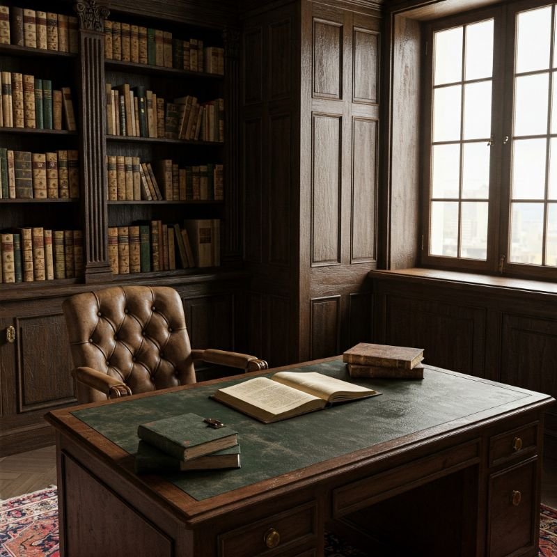
This palette captures the scholarly charm of academia's most intimate workspace—the professor's office, where knowledge is not merely stored but actively engaged with daily. Heritage brown (RGB: 97, 63, 45) forms the foundation, reminiscent of wooden desks marked by decades of scholarly work. British racing green (RGB: 0, 66, 37) adds traditional elegance through leather chair upholstery and desk accessories. Burnt orange (RGB: 201, 90, 46) introduces unexpected warmth through book spines and ceramic objects collected during academic travels. Antiqued brass (RGB: 205, 149, 47) adds subtly reflective elements through desk lamps and picture frames. Parchment (RGB: 255, 234, 188) lightens the composition through papers, books, and natural light filtering through dusty windows. This combination creates a space that feels both intellectual and deeply personal—where serious scholarship coexists with the quirky collections that make each academic's space unique. Doesn't the best thinking often happen in rooms that tell stories through their objects?
Conclusion
The allure of Dark Academia color palettes lies in their ability to transport us to intellectual spaces that value depth, history, and the pursuit of knowledge. By embracing these sophisticated combinations—from the rich browns of ancient libraries to the mysterious blues of midnight study sessions—you create environments that nurture both mind and spirit. These palettes don't merely decorate; they cultivate an atmosphere where thinking deeply feels natural and creativity flourishes in the shadows. Whether you implement these colors throughout your home or create a single scholarly corner, you're connecting with a timeless aesthetic that celebrates the beauty of intellectual pursuit. Isn't there something profoundly satisfying about surrounding yourself with colors that have whispered secrets to scholars through the centuries?
Frequently Asked Questions
What defines a Dark Academia color palette?
Deep, rich tones like browns, greens, and burgundies complemented by warm neutrals and metallic accents.
Can Dark Academia colors work in small spaces?
Absolutely—use darker colors sparingly and balance with lighter neutrals to prevent overwhelming the space.
How do I prevent Dark Academia colors from making my room too dark?
Strategic lighting and lighter accent colors create balance while maintaining the aesthetic's moody charm.
Are Dark Academia colors suitable for modern homes?
Yes, they create compelling contrast in contemporary spaces while adding intellectual depth and character.
What's the difference between Dark and Light Academia color palettes?
Dark Academia embraces deeper, moodier tones while Light Academia features the same colors in softer, airier versions.


