20 Hot Pink and Lime Green Bedroom Ideas to Love
Discover 20 stunning hot pink and lime green bedroom ideas that blend vibrant energy with stylish design for a space that's uniquely you.

Have you ever walked into a room and felt an immediate surge of energy? That's exactly what happens when hot pink meets lime green in a bedroom design. This audacious color combination isn't for the faint-hearted, but when executed thoughtfully, it creates a space that radiates personality, creativity, and zest for life. Like mixing a perfect cocktail, balancing these two powerhouse hues requires a careful hand—too much and you're living in a watermelon; too little and you miss the magic. In this guide, I'm taking you on a chromatic adventure through 20 bedroom ideas that harness the electric potential of hot pink and lime green. From subtle accents that whisper rather than shout, to bold statements that turn your bedroom into a personal gallery of vibrant expression, you'll discover approaches that suit your comfort level while still delivering that undeniable wow factor. Whether you're redesigning your teen's room, creating a guest space that leaves an impression, or reinventing your own sleep sanctuary, these ideas will inspire you to break free from neutral monotony and embrace the energizing power of color psychology. Ready to transform your bedroom from boring to breathtaking? Let's dive into this kaleidoscope of creativity together!
1. The Color Psychology Behind Hot Pink and Lime Green
When you introduce hot pink into your bedroom, you're actually inviting passion, energy, and playfulness into your most personal space. This vibrant hue stimulates excitement and can even increase your heart rate – like having a perpetual crush on your own room! Lime green, meanwhile, brings nature's refreshing vitality indoors, promoting feelings of renewal, balance, and harmony. It's like having a mental cleanse every time you enter. Together, these colors create a psychological powerhouse that can transform your mood from sleepy to invigorated in seconds. Think of it as your personal energy drink, but for your eyes! The key is understanding how these colors make you feel personally, since color response is deeply individual. Have you noticed how certain spaces instantly lift your spirits? That's color psychology at work!
2. Finding the Perfect Balance: The 60-30-10 Rule
Mastering the hot pink and lime green combination requires strategic application, and the 60-30-10 rule is your secret weapon. This design principle suggests using your dominant color (perhaps a softer shade of hot pink) for 60% of the room, your secondary color (lime green) for 30%, and an accent color (maybe black or white) for the remaining 10%. You might paint your walls a muted hot pink, incorporate lime green through bedding and a statement chair, then add crisp white trim for balance. This approach prevents the room from resembling a cartoon explosion and instead creates visual harmony that's bold yet livable. Think of your room as a well-composed photograph – you need a main subject, supporting elements, and thoughtful details. What's your dominant color going to be? The choice sets the entire mood for your space!

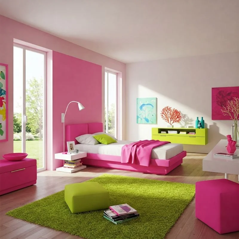
3. Statement Wall: Hot Pink Canvas with Lime Green Accents
Transform your bedroom with a commanding hot pink accent wall that sets the stage for personality and passion. This bold backdrop creates an instant focal point, especially when adorned with lime green elements like floating shelves, framed art, or a striking geometric decal. You're essentially creating a living canvas where the hot pink acts as your base layer while lime green details provide visual interest and depth. For maximum impact, place your bed against this statement wall, then echo the lime accents throughout the room in smaller doses. I recently saw a bedroom where vintage lime green record frames were mounted on a hot pink wall – the effect was both nostalgic and strikingly modern! The beauty of this approach is how easily you can update the look by simply changing the accent pieces without repainting the entire room.

4. Tropical Paradise: Lime Green Base with Hot Pink Florals
Transport yourself to an exotic getaway by reversing the color scheme with lime green as your dominant color and hot pink as your tropical accent. Paint your walls a refreshing lime green or use lime green wallpaper, then introduce hot pink through hibiscus-patterned pillows, a fuchsia throw blanket, or even a stunning hot pink orchid as a living accent. This combination evokes lush rainforests punctuated by brilliant tropical flowers – a natural pairing that feels both energizing and paradoxically soothing. To enhance the tropical vibe, incorporate natural materials like bamboo, rattan, and jute. I've seen this approach work wonders in urban apartments, creating a refreshing oasis that feels miles away from city stress!

5. Retro Revival: 80s-Inspired Hot Pink and Lime Green Design
Dive into nostalgic fun with an 80s-inspired bedroom that celebrates when these colors first became iconic together. Embrace geometric patterns, squiggly Memphis-style designs, and bold contrasts that defined the decade of excess. Start with a neutral base (white works brilliantly) and add hot pink and lime green through furnishings and accessories – perhaps a hot pink bed frame paired with lime green nightstands, or vice versa. Complete the look with black and white checkerboard patterns, splatter paint effects, and acrylic or lucite accessories that scream "radical!" This approach works particularly well for those who appreciate design history with a wink and a nod. The beauty of this retro revival is that it acknowledges the boldness of the pairing while placing it in a context that makes design sense.

6. Modern Minimalist Approach with Bold Color Pops
Even dedicated minimalists can embrace the hot pink and lime green revolution! The trick is maintaining clean lines, uncluttered spaces, and plenty of negative space while strategically introducing these vibrant hues as intentional color pops. Imagine a predominantly white bedroom with architectural elements – perhaps a single hot pink chair as a reading nook, a striking lime green lamp, or a carefully curated gallery wall featuring both colors against white mattes. This approach is like wearing a classic outfit with unexpected statement accessories – the contrast makes both elements more impactful. The disciplined minimalist foundation actually makes the hot pink and lime green elements appear more sophisticated rather than chaotic. I've seen stunning examples where just changing drawer pulls to these colors transforms a basic white dresser into something extraordinary and personality-filled!
7. Geometric Patterns: Combining Hot Pink and Lime Green Shapes
Harness the power of geometry to create structure within your vibrant color scheme. Geometric patterns naturally provide organization for bold colors, making them feel intentional rather than overwhelming. Consider a striking wallpaper featuring lime green triangles against a hot pink background, or vice versa. Alternatively, create your own geometric magic with painted shapes, patterned textiles, or a clever arrangement of solid-colored accessories. The defined edges of geometric forms provide visual stopping points that help the eye process these intense colors more comfortably. For a DIY approach, try creating a geometric feature wall using painter's tape and both colors – the result can be a custom art piece that anchors your entire design.

8. Ombré Effect: Gradual Transition Between the Two Colors
Create visual magic with an ombré effect that gracefully blends hot pink into lime green, mimicking the way these colors might transition in nature (think of a sunset over a lush landscape). This gradient approach softens the contrast between these bold hues while still maintaining their vibrant energy. Apply this technique to a feature wall, curtains, bedding, or even a large-scale art piece. The gradual shift between colors creates depth and dimension that flat color blocks simply can't achieve. I recently saw a bedroom where sheer ombré curtains filtered sunlight through these colors, casting a magical glow throughout the space! For a DIY project, try an ombré effect on plain white pillowcases using fabric dye – the result is custom decor that perfectly matches your color scheme.

9. Neon Signs and LED Lighting for a Glowing Atmosphere
Take your hot pink and lime green bedroom to electrifying heights with strategic lighting that makes these colors truly pop! Custom neon signs in hot pink or lime green can serve as both functional lighting and statement art – perhaps spelling out a favorite word or creating an abstract shape. LED strip lights installed behind headboards, under furniture, or along ceiling perimeters can wash your space in customizable color that can shift between hot pink and lime green at the touch of a button. This lighting approach creates a dynamic space that transforms from day to night, practical to party with simple adjustments. Think of it as creating your personal nightclub vibe! Smart lighting options even allow you to program color changes according to your schedule or mood, making your bedroom responsive to your emotional needs.

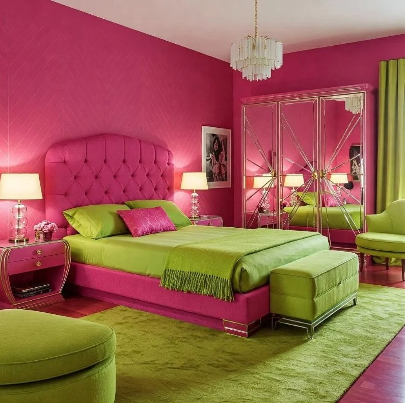
10. Textural Play: Velvet Hot Pink Against Crisp Lime Green
Elevate your color scheme by introducing contrasting textures that add sensory dimension to visual impact. Pair plush hot pink velvet (perhaps on an upholstered headboard or accent chair) with crisp, glossy lime green elements like lacquered side tables or ceramic lamps. This textural contrast creates a multi-sensory experience that engages both sight and touch. The juxtaposition of matte against glossy, soft against hard, and plush against smooth creates depth that makes the color combination feel sophisticated rather than simplistic. I once saw a bedroom with hot pink velvet curtains against lime green grasscloth wallpaper – the textural dialogue between these elements was absolutely mesmerizing! By varying textures, you create points of visual rest despite using bold colors, allowing the eye to process the vibrant palette more comfortably.

11. Botanical Infusion: Plants and Green Elements with Pink Backdrops
Harness nature's own color contrast by pairing lush green plants against hot pink backdrops for a design approach that feels simultaneously bold and organic. Paint a wall hot pink and position a statement fiddle leaf fig, monstera, or palm against it for instant design magic. The natural green of the plants softens and contextualizes the artificial lime green elements elsewhere in your room. This botanical approach creates a visual bridge between the natural world and your bold color choices. For maximum impact, choose plants with interesting shapes and textures – the silhouette of a dramatic plant against a hot pink wall creates living art! Not gifted with a green thumb? High-quality faux plants can achieve the same visual effect without the maintenance, though nothing beats the air-purifying benefits of real greenery!

12. Art Deco Influence: Structured Use of Both Colors
Channel the sophisticated glamour of Art Deco by applying hot pink and lime green within structured, symmetrical designs featuring bold geometry and metallic accents. This historic design movement provides perfect containment for vibrant colors through its emphasis on form, pattern, and architectural elements. Imagine hot pink and lime green in fan patterns, sunburst motifs, or stepped forms typical of Deco design, perhaps accented with gold or chrome for period authenticity. The formality of Art Deco's structured approach paradoxically makes the bold color pairing feel more refined and intentional. A stunning implementation might include a hot pink velvet bed with lime green and gold geometric patterned pillows against a wall featuring subtle Deco-inspired trim work. The elegant framework of Art Deco design lends credibility to even the most daring color combinations!
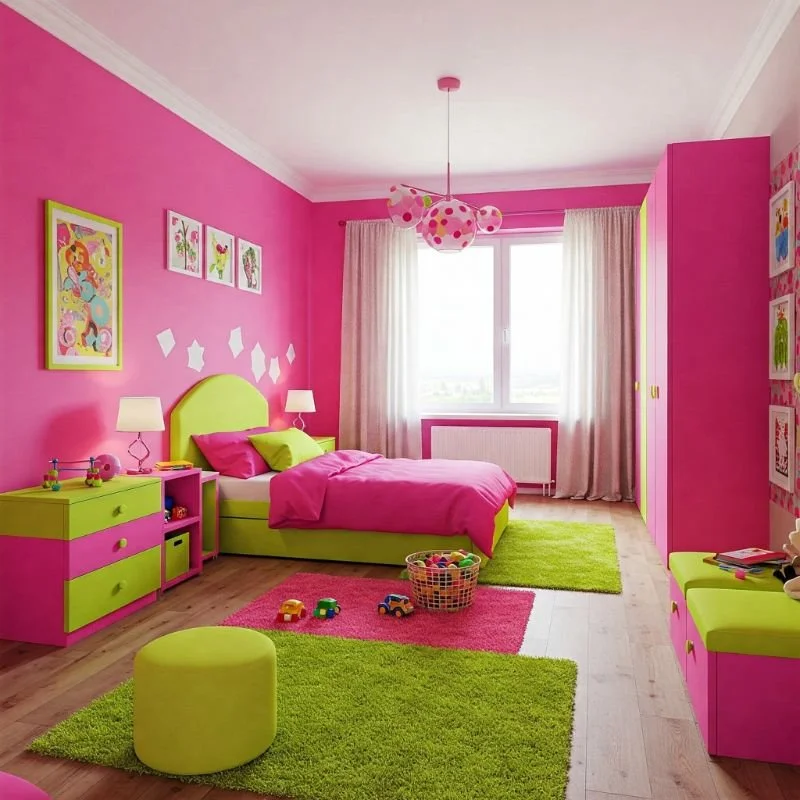
13. Kid-Friendly Spaces: Playful Implementation of Bright Colors
Children naturally gravitate toward bright colors, making a hot pink and lime green bedroom perfect for younger family members! The key to a successful kid's space is balancing vibrant energy with functional design that supports sleep and activities. Consider using these colors in playful patterns like polka dots, stripes, or cartoon-inspired murals. Incorporate practical elements like washable paint finishes, storage solutions in alternating colors, and flexible furniture that can evolve as your child grows. One brilliant approach I've seen features magnetic and chalkboard paint sections in these colors, creating interactive walls that entertain and educate. The beauty of designing for children is the permission to embrace whimsy – think lime green bunk beds with hot pink ladders, or vice versa! Remember that children experience color more intensely than adults, so providing some visual rest areas is important too.
14. Teen Dream: Sophisticated Yet Bold Bedroom Design
Teenagers crave self-expression while developing more sophisticated taste, making a hot pink and lime green bedroom perfect for this transitional age. The key is incorporating these bold colors in ways that feel fashion-forward rather than childish. Take cues from current trends in clothing, music, and social media that teens respond to – perhaps industrial elements mixed with vibrant colors, or vintage pieces reimagined in bold hues. Consider a charcoal or white base with strategic applications of hot pink and lime green through wall art, textile layers, and lighting. Digital elements like LED strips that can change colors offer flexibility as tastes evolve. I've seen impressive teen rooms where mood boards featuring magazine cutouts, photos, and fabric swatches in these colors create personalized art installations that reflect emerging identities.

15. Accent Furniture: Statement Pieces in Hot Pink or Lime Green
Make a bold declaration with strategic furniture pieces in hot pink or lime green that serve as functional sculptures within your space. A lime green upholstered bed frame, a hot pink dresser, or a vibrant accent chair can anchor your design while allowing surrounding elements to be more subdued. This approach lets you control the color dosage precisely – a single hot pink chaise in an otherwise neutral room creates dramatic focus without overwhelming the space. Look for pieces with interesting silhouettes that deserve attention – perhaps a wingback chair in lime green velvet or a hot pink mid-century credenza with distinctive legs. The beauty of statement furniture is its movability – you can refresh your design by simply relocating your colorful piece to create a new focal point without repainting or major renovations.

16. Textile Magic: Bedding, Curtains, and Pillows in Dual Colors
Transform your bedroom seasonally or on a whim by focusing your color play on easily changeable textiles. Layer your bed with hot pink sheets, lime green shams, and a reversible duvet featuring both colors. Window treatments in either shade can dramatically shift the room's feeling – imagine the difference between hot pink blackout curtains versus sheer lime panels that filter light! The textile approach offers maximum impact with minimal commitment, perfect for renters or the design-fickle. Create depth by mixing patterns that incorporate both colors – perhaps floral prints with geometric designs in complementary scale. Textiles also introduce textural variety through weaves, embroidery, and fabric types that add sensory richness to your color story. The best part? You can completely transform your room in an afternoon simply by swapping out these soft elements!

17. Black and White Base with Hot Pink and Lime Green Accents
Ground your vibrant color duo with the timeless sophistication of black and white to create a scheme that feels both bold and classic. This approach uses neutrals as a structured framework within which hot pink and lime green can shine without competing. Try white walls with black furniture, then add hot pink and lime green through accessories, art, and textiles. This combination works brilliantly because the black and white elements provide visual relief and containment for the bright colors. Think of it as creating a gallery-like space for your colorful elements to be properly appreciated! The contrast of achromatic with chromatic creates dynamic tension that elevates the entire design. I've seen stunning bedrooms with black and white striped walls where hot pink and lime green accessories pop dramatically – the structure of the stripes somehow makes the bright colors appear more intentional and sophisticated.

18. Bohemian Approach: Eclectic Mix with Vibrant Color Palette
Embrace the "more is more" philosophy of bohemian design by incorporating hot pink and lime green within a rich tapestry of patterns, textures, and global influences. This approach celebrates color through layering and unexpected combinations – think hot pink Moroccan poufs against vintage lime green Chinese cabinets, or Indian block print textiles featuring both hues. The secret to successful bohemian spaces is creating harmony through repetition of colors throughout diverse elements. Incorporate natural materials, metallics, and artifacts that tell personal stories. The beauty of bohemian design is that it evolves organically as you collect and curate over time. One stunning boho bedroom I recall featured a canopy bed draped with sheer fabrics in both colors, surrounded by potted plants, vintage finds, and travel souvenirs – the overall effect was like sleeping inside a vibrant, personal treasure box!

19. Small Space Solutions: Making Compact Rooms Pop with Color
Contrary to conventional wisdom, bold colors like hot pink and lime green can actually work magic in small bedrooms when applied strategically! Use these vibrant hues to create optical illusions that enhance your space – perhaps a hot pink ceiling that draws the eye upward or lime green at the far wall to create depth. Mirrors framed in either color can bounce light while reinforcing your scheme. Consider color-blocking techniques that define zones within your compact room, making it feel more organized and purposeful. In tiny spaces, these bold colors become even more impactful, transforming spatial limitations into design advantages. I've seen spectacular tiny bedrooms where hot pink closet interiors create surprise moments of delight, or where lime green storage solutions become functional art pieces.

20. Seasonal Adaptability: Changing Accents Throughout the Year
Create a bedroom that evolves with the seasons by establishing a foundation that allows hot pink and lime green elements to be adjusted seasonally. During spring and summer, maximize both colors for energetic vibrance; in fall, pair hot pink with deeper greens and autumn tones; for winter, combine lime accents with rich magenta and burgundy for a holiday-appropriate variation. This approach might involve a neutral base with interchangeable elements – perhaps white walls and furniture with seasonal textiles, artwork, and accessories that can be stored and rotated. Adjustable lighting with colored bulbs or filter options allows you to shift the mood instantly. I love bedrooms with "capsule decor collections" that get swapped quarterly! This seasonal adaptability not only keeps your space feeling fresh but also attunes your environment to the natural rhythms of the year, potentially improving your sleep cycles and mood.

Conclusion
Bringing hot pink and lime green into your bedroom isn't just about following a trend—it's about creating a space that energizes, inspires, and truly reflects your personality. Whether you've chosen to go all-in with painted walls or started small with accent pieces, remember that the most successful spaces are those that make you happy when you enter them. Color is deeply personal, and these vibrant hues can transform not just your bedroom but potentially your outlook. The beauty of design is that nothing is permanent—you can always adjust, adapt, and evolve as your taste changes. So embrace these energetic colors with confidence, knowing that you've created a space that's uniquely yours, bursting with life and personality.
Frequently Asked Questions
1. Won't a hot pink and lime green bedroom make it hard to sleep?
Strategic placement of colors and dimmable lighting can create a restful atmosphere despite vibrant colors.
2. How can I introduce these colors without painting my walls?
Textiles, artwork, and accessories offer commitment-free ways to incorporate these bold hues.
3. What's the best neutral to pair with hot pink and lime green?
White creates fresh contrast, while gray or black adds sophistication to the vibrant combination.
4. Can these colors work in a master bedroom?
Absolutely! The key is balancing intensity with areas of visual rest.
5. How do I prevent the room from looking like a watermelon?
Add a third color like white, black, or gold to break up the direct association.
Stay up to date with our latest ideas!